The Science in 30 Seconds
- The Problem: Traditional A/B testing is a "lagging indicator." You only find out a design failed after you've wasted budget and 14 days of traffic.
- The Gap: A/B tests measure Action (the click) but ignore Attention (the gaze). If the user doesn't see the button, the copy doesn't matter.
- The Fix:
expozepredictive eye-tracking. Use AI to simulate attention in 5 seconds before you code a single line
Why A/B Tests Fail: The "Blind Optimization" Trap
Most organizations treat A/B testing as the first step in the scientific process. In reality, it should be the last.
Consider a typical hypothesis: “Green buttons will outperform blue buttons.” You deploy the test, split your traffic, and wait 14 days for statistical significance. The result? Statistical noise. You have burned two weeks on a test that was structurally flawed from inception. If neither button was ever seen by the user because of high Cognitive Load elsewhere on the page, the color was irrelevant.
Applied Science demands precision. We do not guess the winner; we predict the visibility.
.webp)
The Solution: Predictive "Pre-Flight" Optimization
Predictive Eye-Tracking fundamentally restructures the design workflow. Rather than exposing live traffic to unproven variants, we utilize AI to simulate human attention distribution.
The Direct Answer (Snippet Trap):
Predictive Eye-Tracking is a machine-learning technology that simulates human visual processing. Unlike biological eye-tracking, which requires hardware and participants, predictive models like expoze generate instant heatmaps with >90% accuracy. This allows marketers to identify "Hot Spots" (High Attention) and "Cold Zones" (Blind Spots) to validate designs prior to a live A/B test.
The Three Neuro-Scientific KPIs of a Winning Test
In 2026, "looking good" is not a metric. We use expoze to measure three specific markers that determine if a test is even worth running:
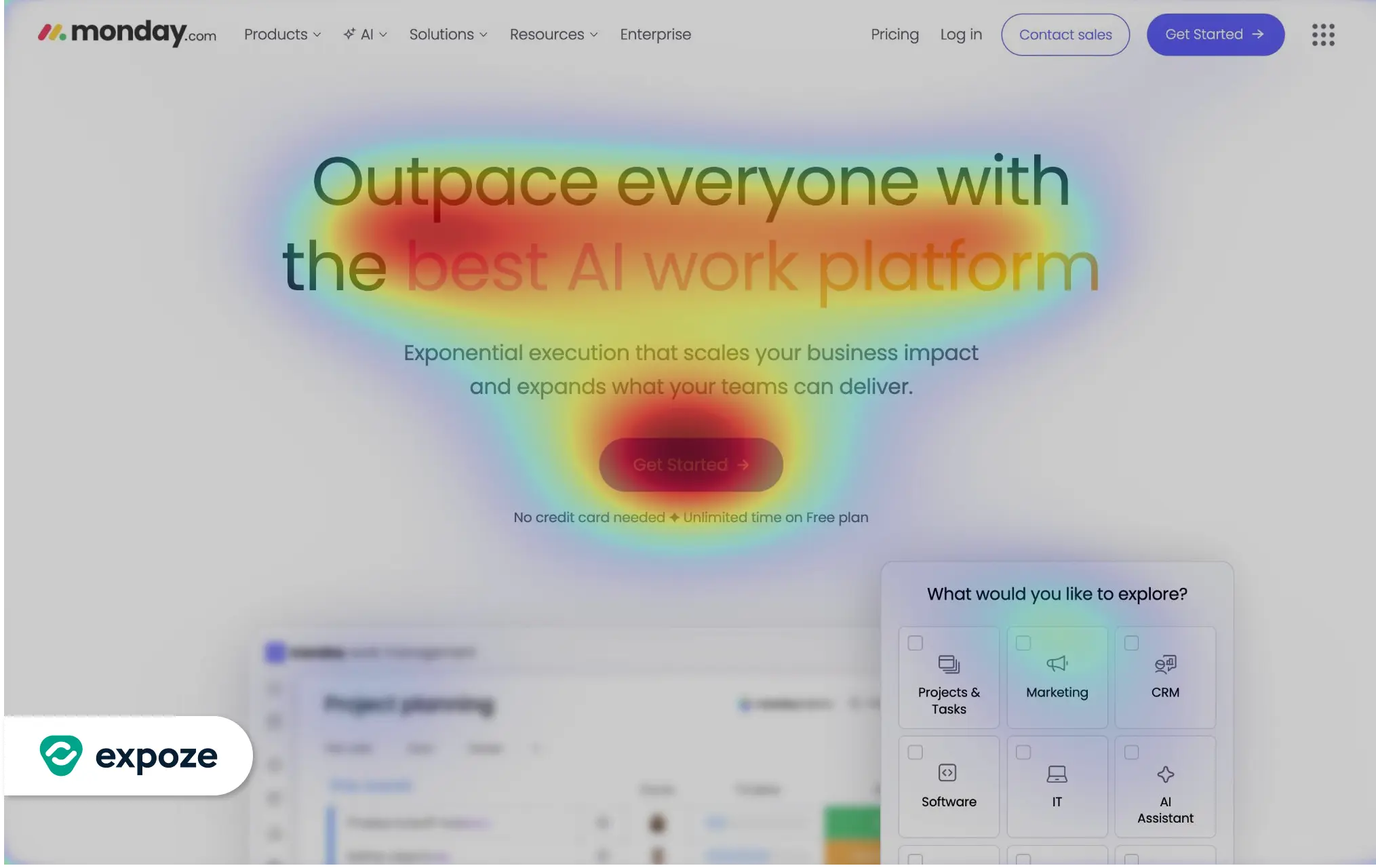
1. Visual Salience (The Signal)
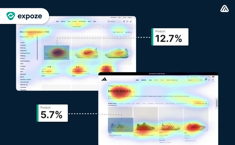
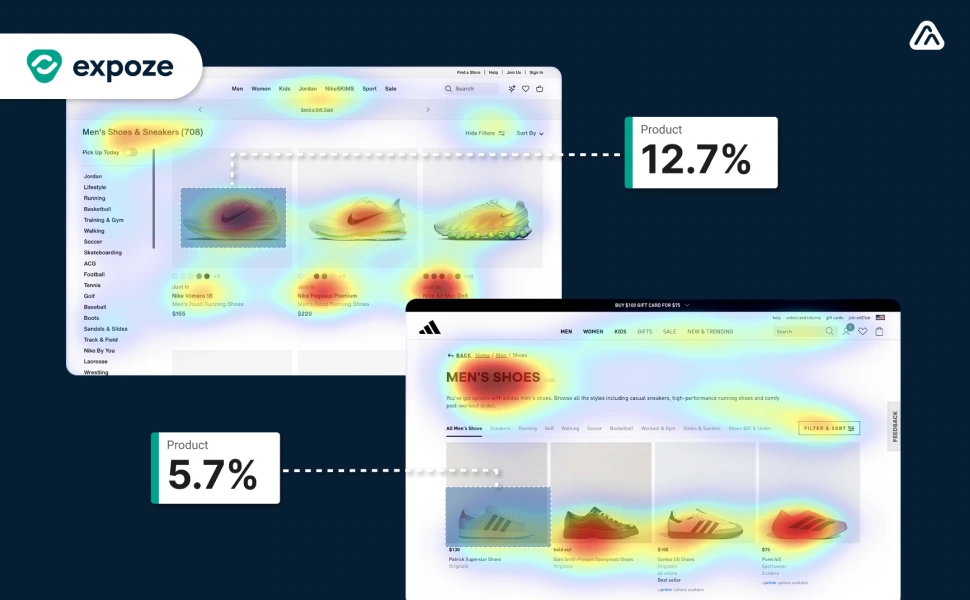
Salience is the probability of an element capturing attention relative to its surroundings. If your primary CTA has lower salience than a decorative background image, the user's brain filters the button as "noise." Use Attention Metrics to benchmark this.
2. Cognitive Load (The Friction)
High visual complexity triggers subconscious avoidance. If your heatmap shows scattered, chaotic attention, you have exceeded the simplicity threshold. This is vital for conversion; the brain inherently favors designs that are easy to process—a phenomenon known as Cognitive Ease.
When a design is too complex, the "processing cost" becomes too high, and users mentally check out before reaching your CTA. To learn how to streamline your layouts and improve your performance scores, explore our clinical guide on How to Improve Your Cognitive Ease Score.
3. Focus Order (The Narrative)
Does the eye move from Product to Value Prop to CTA? If expoze shows the path leads to the Footer first, your narrative is broken. No amount of copy-tweaking fixes a broken visual hierarchy.
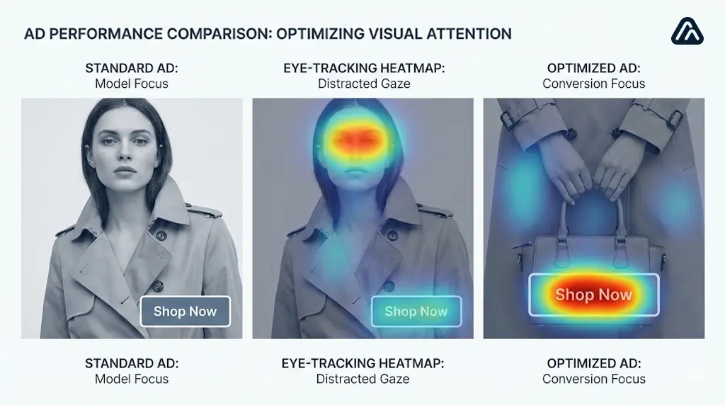
Case Study: The "Visual Vampire" Diagnosis
In the following example, an e-commerce brand tested a "Lifestyle" variant. Without data, it looked like a winner. With expoze, the failure was obvious before launch.
The Diagnosis:The model’s face acts as a "Visual Vampire." Biological imperatives force humans to prioritize faces above all other stimuli. Consequently, the "Checkout" button resides in a "Cold Zone."
If this variant entered a live A/B test, it would fail. By executing a pre-flight check, the design can be corrected (e.g., cropping the image or adjusting gaze) to ensure the live test measures the strategy, not a layout error.
How to Speed Up A/B Testing: An Agile Workflow
To integrate predictive AI is to accelerate the feedback loop. Use this 3-phase quality gate:
Phase 1: Wireframe Validation (Low Fidelity)
Upload structural wireframes to expoze.
- Objective: Validate Focus Order. Does the eye traverse the layout from Top-Left to Bottom-Right?
Phase 2: The "Visual Vampire" Audit (Mid Fidelity)
Prior to stakeholder approval, execute a heatmap scan.
- Objective: Identify distracted attention. Is a secondary element cannibalizing the Salience of the primary CTA?
Phase 3: Pre-Launch Qualification (High Fidelity)
Before the A/B test is live, benchmark the variants.
- Objective: Establish a threshold. If Variant A scores 70% Visibility and Variant B scores 45%, Variant B is disqualified. It does not merit the ad spend.
Pro Tip: For display advertising, utilize our 9 New Display Ad Testing Templates for Figma to ensure structural integrity from the first pixel.
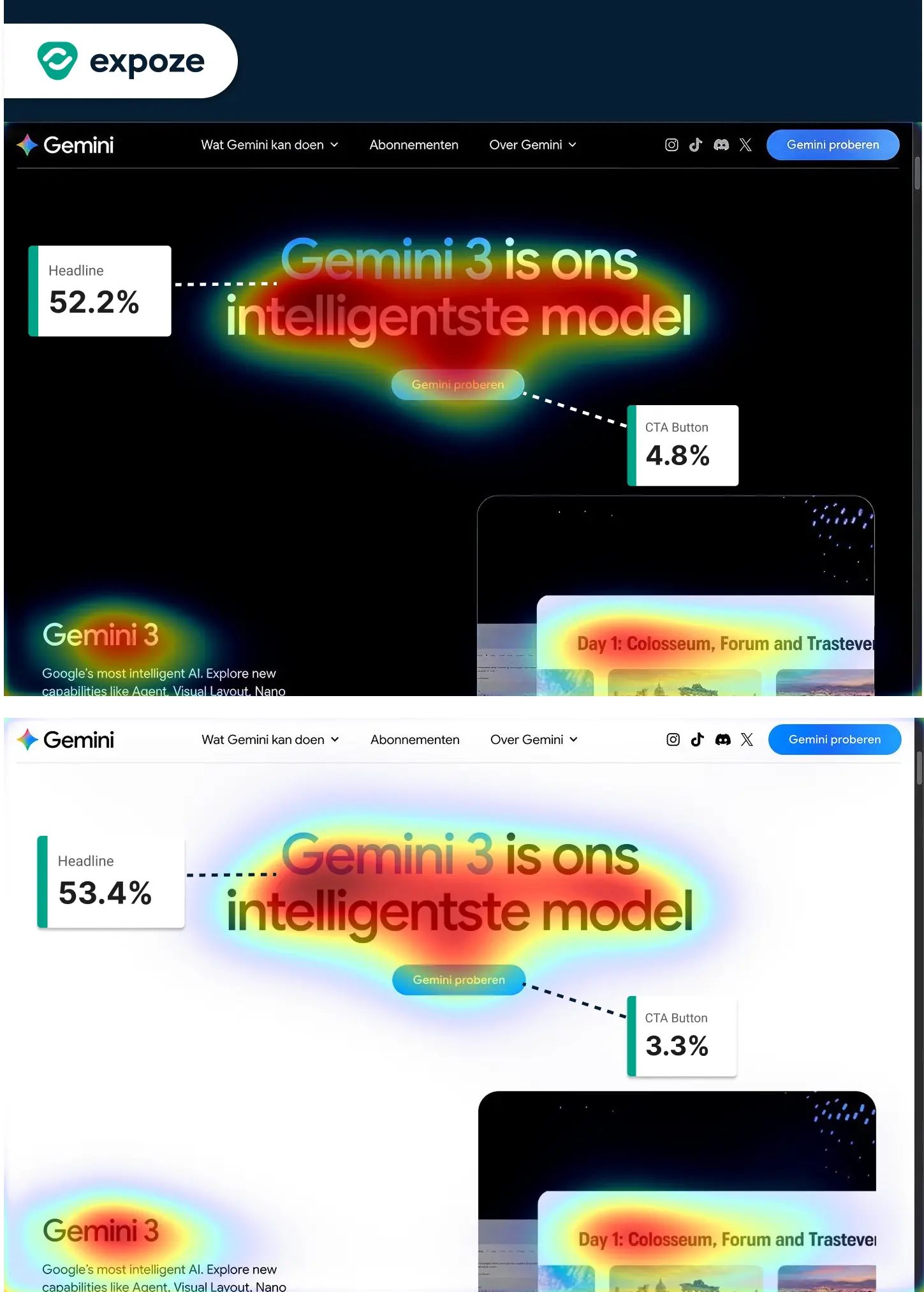
Modern A/B testing must account for user environment variables—specifically Light vs. Dark Mode. As seen in our Gemini Mode-Salience Analysis (Figure 4), shifting the UI theme can fundamentally reorder your Focus Order.
Before committing to a live A/B test, run your variants through both themes. If your CTA visibility drops by more than 15% in Dark Mode, your design isn't mode-resilient. Use expoze to validate that your "winning" variant performs consistently regardless of the user's system preferences. This prevents "false positives" where a design wins in your office's light-filled studio but fails for a user browsing on a dark screen at night.
Conclusion: Data Over Dogma
A/B testing is a critical instrument for refinement, not discovery. By integrating alpha.one expoze, you shift from "Testing Guesses" to "Validating Science." You preserve budget, accelerate cycles, and ensure that when a test goes live, you are evaluating the strongest possible creative execution.
Stop guessing. Start testing with expoze today and execute your first pre-flight check immediately.
About the Imagery The visual elements in this post, including the hero image and technical figures, were co-created with Gemini AI. They have been stylized to match a custom color palette (#061E33, #0096FA, etc.) to ensure a consistent aesthetic across this project.

.png)